Challenge.
The opportunity emerged from an unexpected intersection: a growing segment of witches and spiritual practitioners becoming curious about technology due to recent AI innovations.
Despite spirituality and technology traditionally being viewed as opposing forces, there was clear market validation—an exclusive “Tech Witchcraft” course teaching HTML/CSS to this audience generated 30 sales with remarkable Facebook ad performance: $0.11 cost per click and 18% conversion rate.
The core problem: Modern witches wanted to digitize their practice but existing solutions failed them. Traditional grimoire-keeping (magical journals) suffered from accessibility issues—practitioners would forget to document their rituals because physical books weren’t always at their fingertips, and important insights would never resurface organically for pattern recognition.
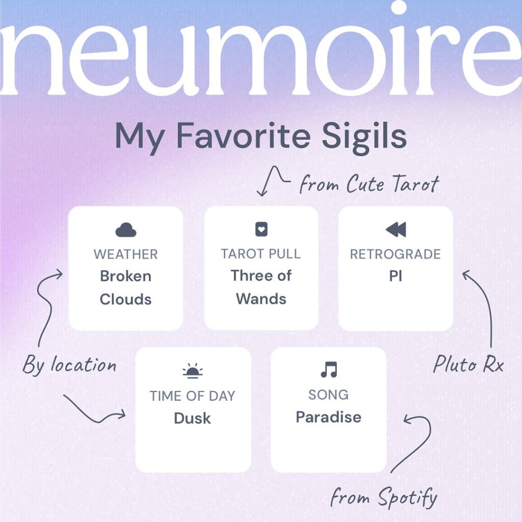
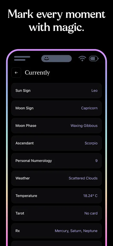
Technical complexity challenges included building a tagging system that automatically pulled metadata from multiple sources (astrology, weather, music, tarot) while maintaining flexibility for custom tags. Each external API (Spotify, astrology, numerology) had different formats, limits, and response times, requiring careful mapping and caching strategies.
Budget and timeline constraints meant prioritizing core tagging functionality over advanced features, relying on free API tiers and lightweight infrastructure to ship a working prototype quickly for concept validation.
The design challenge was particularly nuanced: creating a system that felt ritualistic and magical while remaining intuitive in a modern mobile context. The interface needed to honor the mystery and symbolism of traditional sigil practices while translating abstract metadata into clear, meaningful interactions.
How we solved it.
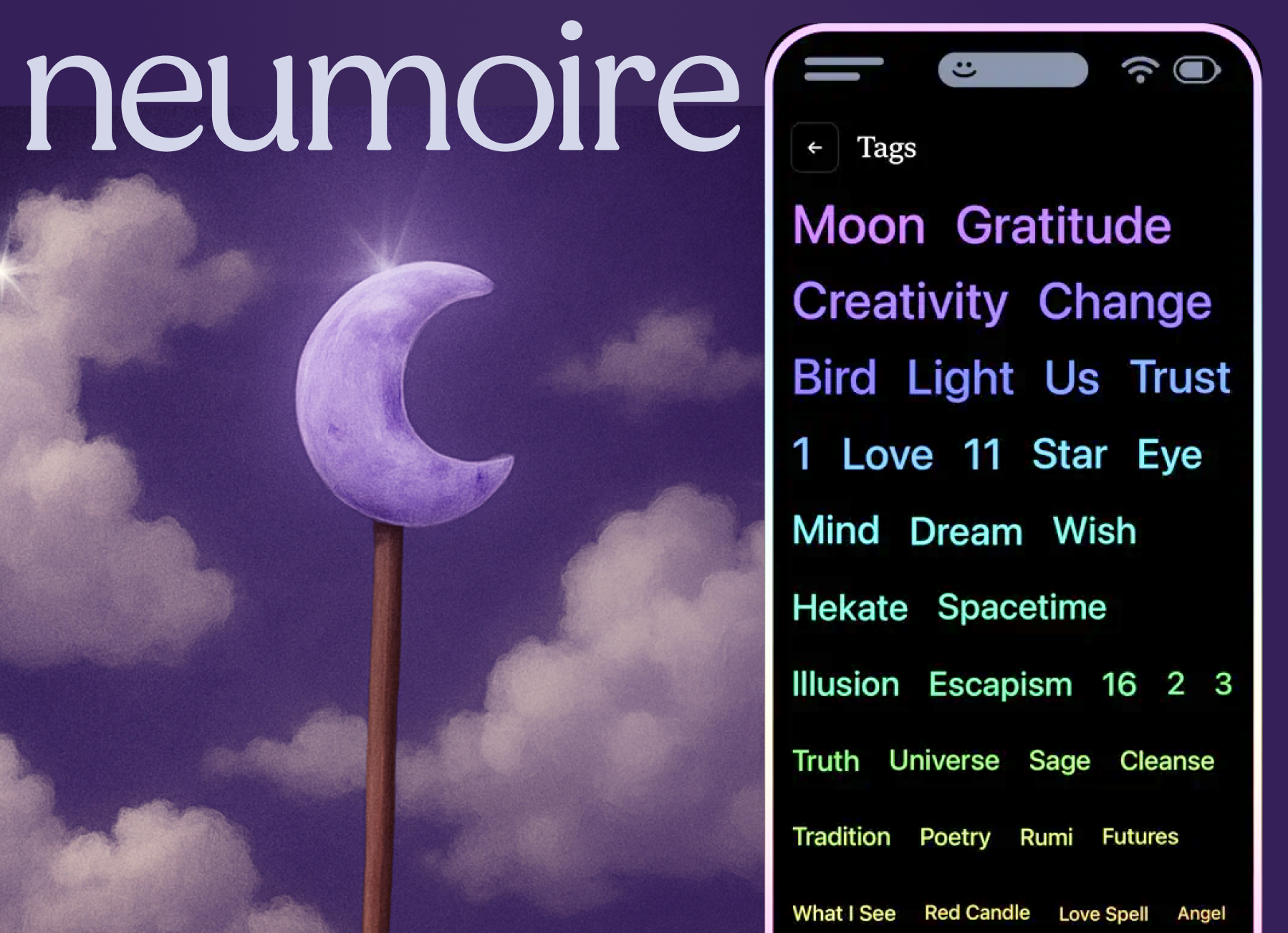
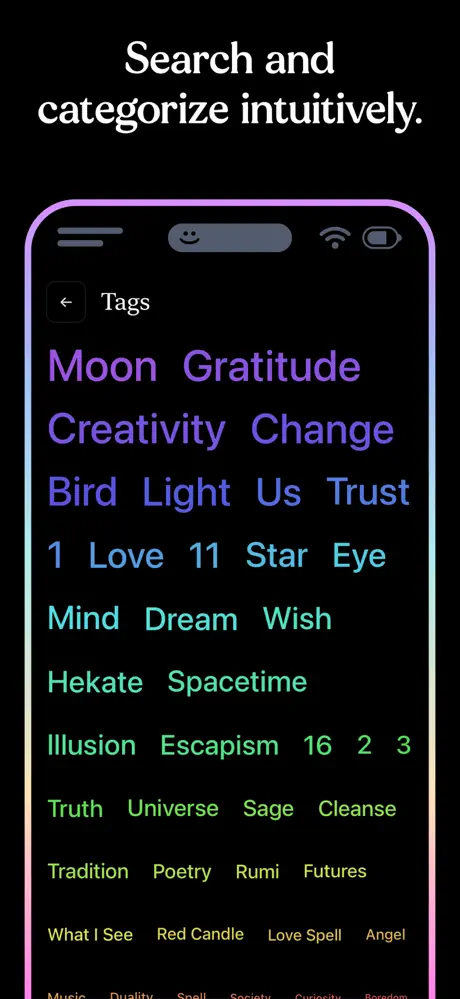
Instead of treating data as technical labels, we reimagined every piece of metadata as a sigil-like stamp—poetic, automatic tags like “Waxing Crescent in Pisces” or current Spotify track names. This transformed the experience from filling database fields to having entries marked by surrounding forces, creating a sense of magical documentation.
Invisible Integration Architecture
The system quietly pulled astrology, numerology, weather, and music data without user input, emphasizing surprise and delight over technical process. Users experienced “oh, it already knows” moments rather than loading states or manual connections, maintaining the mystical flow of their practice.
🔮 Surface simplicity: Initial view showed entries with a few visible tags, avoiding overwhelming users
🌙 Expandable depths: Tapping or swiping revealed hidden stamps, related tags, and temporal patterns
✨ Subtle guidance: Small glyphs hinted at deeper layers, making discovery feel earned rather than obvious
🎨 Chakra-coded emphasis: Purple to red color progression indicated tag power or consistency
Aesthetic Pivot & Community Alignment
What would you have done differently?
Early user feedback dismissed the initial light purple theme as “love & light”—misaligned with community identity. The pivot to dark-mode-first design influenced every element: arcane typography, subtle line icons, slower interactions with soft fades. This created a genuinely ritualistic interface rather than a re-skinned productivity app.


Respectful UX Innovation
While following core mobile conventions (search, timelines, cards) for familiarity, we bent traditional hierarchy rules to create mystery. Tags themselves became portals to different views instead of conventional filter menus, honoring both usability and the magical mindset. We emphasized privacy due the subject matter. (Magic spells—the data, results, and practice— are intellectual property.)
Technical Foundation
MySQL storage and lightweight Node.js server infrastructure supported the experimental nature while the tagging system remained designed for future scalability without requiring complete rewrites.
Outcome.
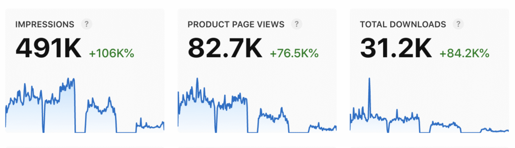
The dark mode pivot and sigil tagging system resonated strongly—the app achieved 30,000 downloads and attracted dozens of paying customers within just two months of monetization, despite serving a niche market.
User Engagement Patterns
Automatic tagging became central to user behavior, with most entries receiving multiple auto-stamped sigils. Tag-based searching emerged as a core interaction pattern, validating the discovery-focused design approach.
Turns out the best apps are ritualistic.
Educational Integration
When introduced as part of the Tech Witchcraft course, students treated the tool as both a practical magical diary and a case study in digital ritual design, demonstrating successful crossover between education and product.
Functional Success
The automatic metadata collection worked as intended, with users reporting surprising pattern discoveries—moon phases aligning with emotional states, meaningful song recurrences, and other correlations that enriched their spiritual practice.
Community Design Learning
The project proved that leaning into authentic community aesthetics (dark, arcane, layered) and avoiding overly polished “app-like” design created stronger audience bonds than mimicking mainstream productivity tools. Sometimes the most powerful UX decision is embracing what makes your users feel truly seen.
The grimoire demonstrated that successful niche design requires deep community immersion and willingness to break conventional rules in service of authentic user connection.