Challenge.
The opportunity emerged from clear market trends: students desperately needed efficient study tools that could actually help them pass their classes, while entrepreneurs and demand generation marketers saw the SEO potential in the education space. The challenge was creating a social studying platform that could compete with established players like Quizlet and Knowt.
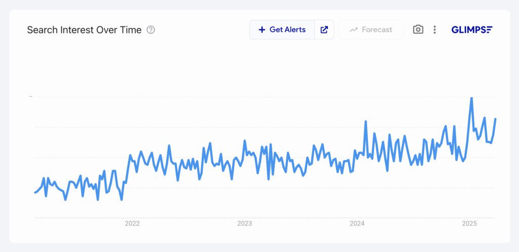
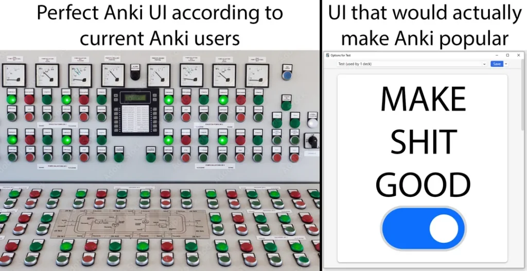
The core problem: Students using traditional flashcard apps like Anki struggled with motivation and consistency. While these tools were effective, they lacked the social engagement and gamification that could sustain long-term study habits. Any motivation is an edge—so social features and gamification became essential to user success.
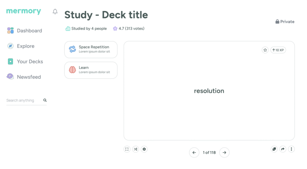
Budget and scope constraints: Forced strategic decisions early. Through wireframing exercises, we identified that we only wanted to build 2 of the 6 studying methods that competitors offered. We focused on spaced repetition and “learn” mode, cutting the other four to ship fast and validate the core concept.
The design challenge: Particularly complex: creating a brand that would instantly resonate with students while competing directly with Knowt, who had already claimed our ideal color scheme. The platform needed to feel both friendly and credible—a balance that required careful consideration of every brand element, from naming to mascot design.
Mermory.com: Available! ✅
How we solved it.
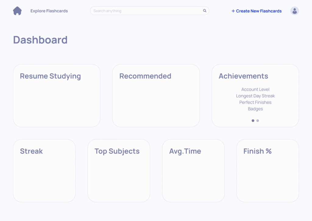
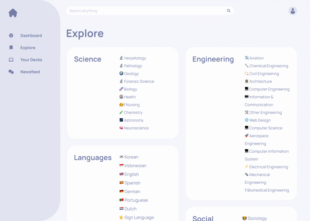
Starting with rough wireframes—doctored screenshots with boxes and arrows—we rapidly iterated until the core functionality felt right. Once we had buy-in on screen elements, refined wireframes led to strategic feature cutting based on a VALUE x FEASIBILITY matrix for MVP development.
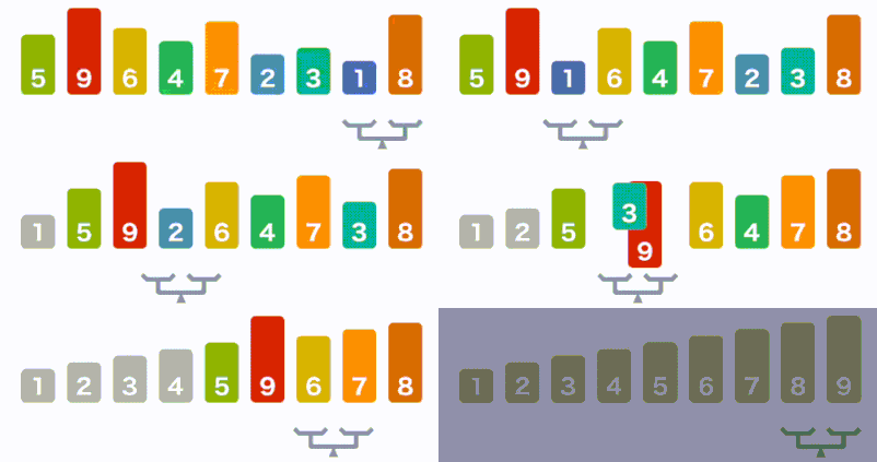
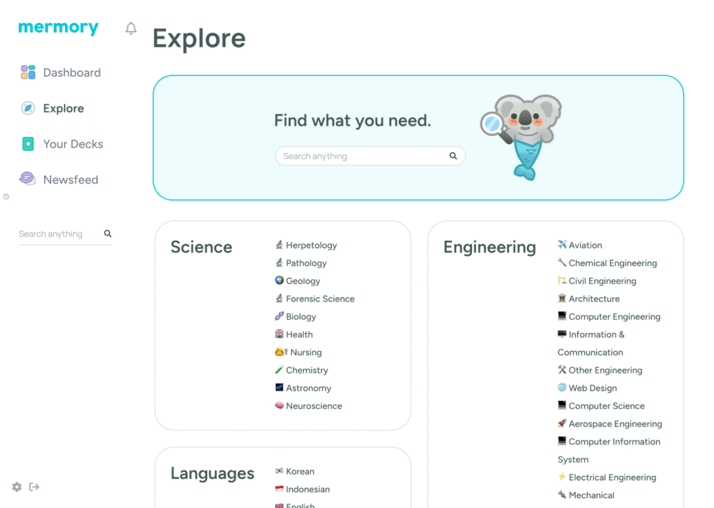
Brand Innovation: The name “Mermory” emerged through rapid ideation cycling—a “bubble sort” algorithm of yes/no decisions until landing on an available .com that perfectly captured the mission. The nautical theme naturally followed, leading to our signature “merkoala” mascot.
The merkoala choice wasn’t overthought—it came from cycling through anthropomorphized animal options until finding one with the strongest silhouette. A koala-mermaid hybrid felt like “special wrongness”—that magical 1+1=3 equation where unexpected combinations create something memorable.
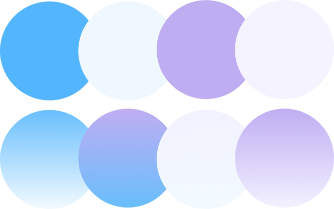
Visual Differentiation: To compete with Knowt’s established color palette, we used more white space and fewer colors, maintaining our brand identity through restraint rather than boldness. Multiple color scheme prototypes were tested alongside pure color studies (overlaid shapes measuring cohesiveness and contrast) and Pinterest/Dribbble inspiration boards to communicate vibe beyond just UI—from calming blue-purple combinations to energized blue-green schemes.


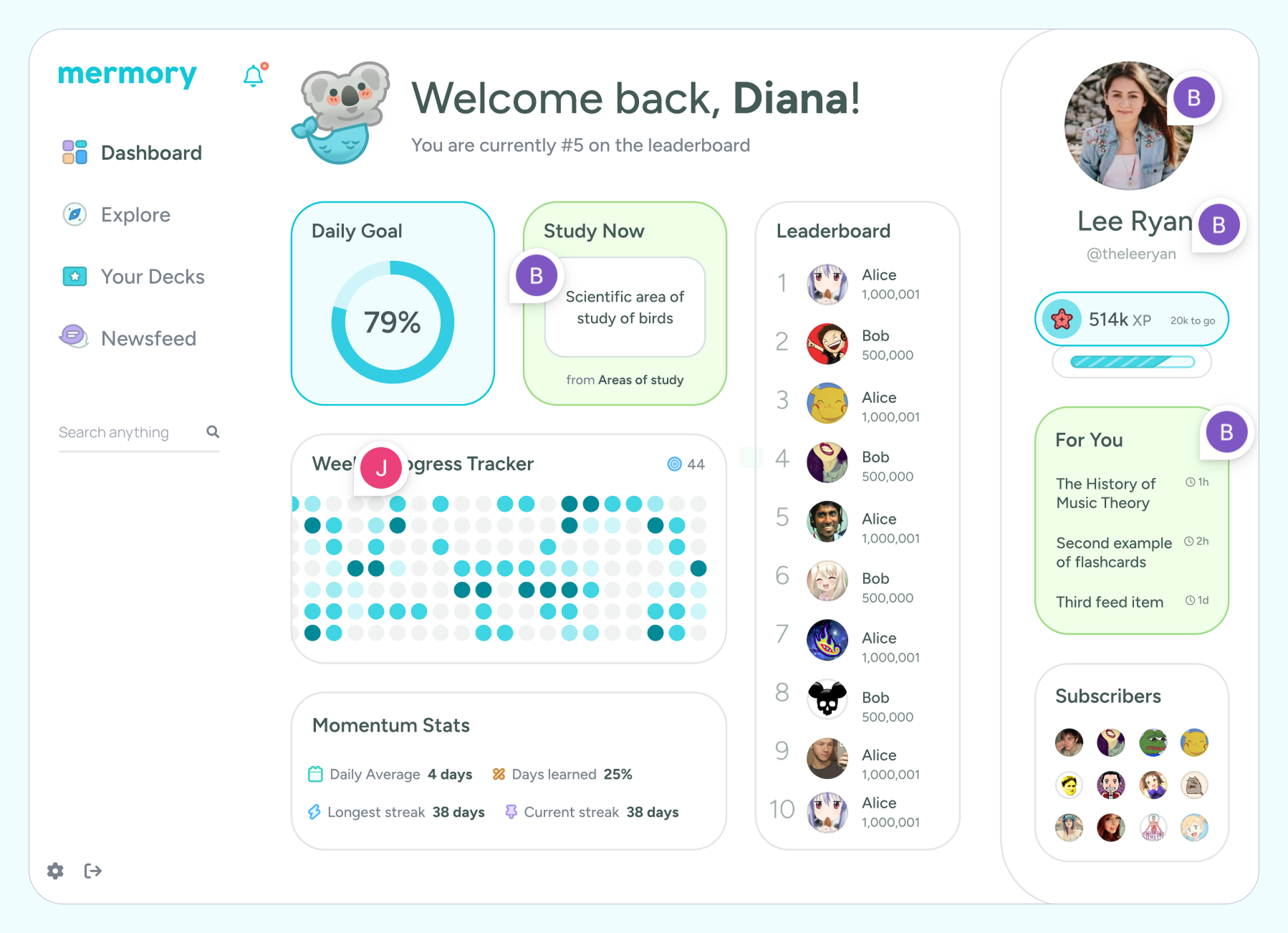
The social studying experience centered on motivation through visibility and competition:
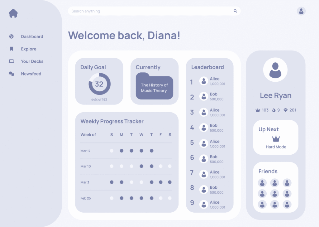
📊 Daily goal tracking with pie chart visualization
⚡ Strategic “Study Now” placement showing the next flashcard question (not hidden) to trigger immediate answer-thinking and clicking tension
📈 Comprehensive momentum stats including daily averages, streak tracking, and learning percentages
🔍 Social discovery with FYP suggestions surfacing relevant flashcard packs from other users
🌊 Nautical-themed XP system with level icons (starfish to whale progression)
Data Visualization Focus: Learning that volume of flashcards directly correlates to better grades, we prioritized surfacing as many relevant cards as possible through clean data visualization—using minimal space for maximum insight impact.
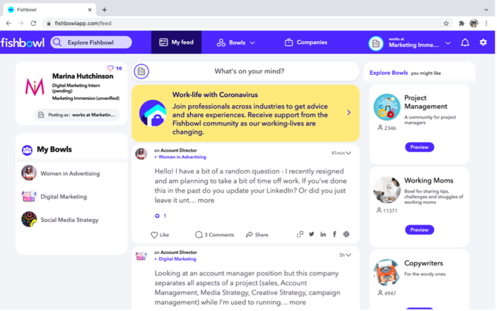
Technical Foundation: For the forum components, we drew inspiration from the Fishbowl community professional network design—a platform known for facilitating honest conversations within industry communities. This provided a model for web-first forum design that felt modern without trying to mimic mobile interfaces.
Outcome.
The project demonstrated that sometimes the best strategy isn’t overthinking—rapid iteration, gut-checked decisions, and close client collaboration can produce results that resonate authentically with target audiences while standing out in crowded markets.
Team Dynamics & Energy
The founders remained consistently motivated and energized throughout the project. Close collaboration (including text communication throughout development) created an environment where they could ideate freely, knowing their ideas would be respected and executed thoughtfully.
User Response to Branding
During usability testing, users were visibly impressed with the design and asked who had created it. While not a hard metric, this reaction indicated strong remarkability—exactly what we’d hoped to achieve with instant student connection.
Design Learning
This project marked one of only three projects of mine where data visualization was the focal point, teaching valuable lessons about using appropriate space for data insights rather than defaulting to maximum information density.
Strategic Validation
The streamlined feature approach (2 study methods vs 6) proved correct for MVP validation, allowing rapid shipping while maintaining core functionality that directly impacted student success.
