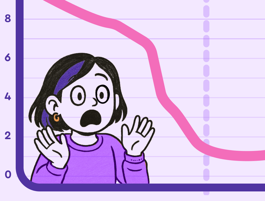
My client, a successful ecommerce owner, couldn’t tell me his sales trends during our strategy call.
Not because he didn’t care, but because Google Analytics buried it in a maze of cluttered widgets. I watched his stress spike as he clicked frantically between tabs.
Two weeks later, after a minimal dashboard setup in WordPress, he rattled off key metrics from memory. His voice was calm, confident.
He was able to answer our questions accurately, which resulted in a better product, launched faster, with no unnecessary bells or whistles.
That transformation—from anxious confusion to serene mastery—captures the difference between dopamine-driven flashy visuals and the deeper reward of true data comprehension.
From Dopamine to Serotonin.
This is what neuroscientists might call moving from dopamine (quick, attention-grabbing stimulation) to serotonin (lasting satisfaction and confidence).
When most people think about making interfaces engaging, they think about dopamine — the quick hits that come from gamification, novelty, or little bursts of delight. That has its place, and soon we’ll share our thoughts in a companion piece: Gamification Best Practices for 2026.
But in data visualization, dopamine isn’t enough. What we’re aiming for is serotonin.
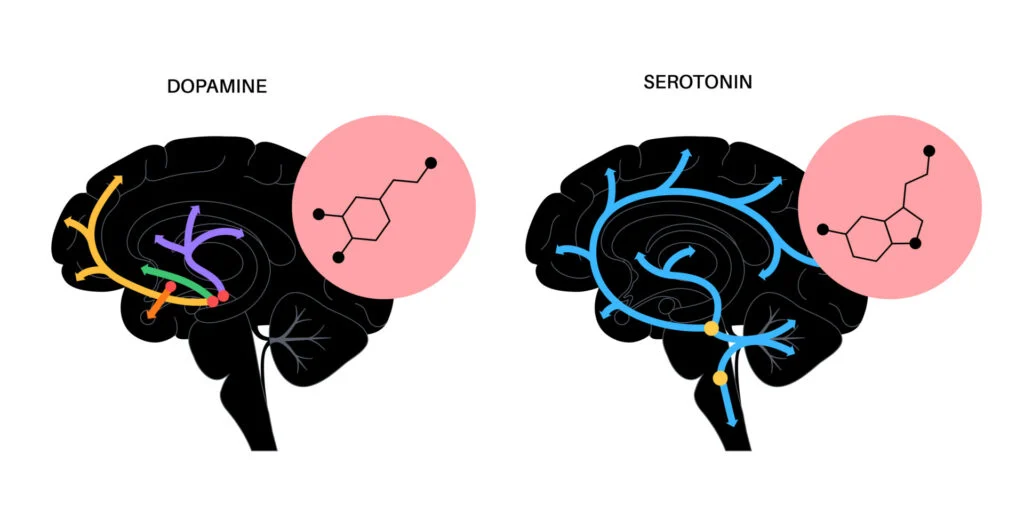
Serotonin is about stability, calm, and long-term satisfaction. In UX, it shows up when people feel confident in what they’re seeing and relieved that they understand it. It’s the deeper reward of clarity and trust — not just a quick “aha!” but the lasting sense that the product works for them.
Our framework is simple:
Clarity → Usability → Serotonin
- Clarity: data shown in a way that makes sense.
- Usability: people can act on what they see.
- Serotonin: the calm satisfaction of understanding.
Hot take alert 🔥
Here’s the controversial truth: while founders burn millions chasing unicorns, quiet millionaires get rich with a boring secret: taking people’s messy data and showing it back with clean, intuitive design.
Look at Asana ($5.5B valuation) or Tableau ($15.7B sale)—they didn’t invent new data, they made existing data understandable.
When Bad Visualization Kills
Knight Capital lost $440 million in 45 minutes partly because their trading dashboards failed to clearly show system malfunctions. Data visualization couldn’t have prevented the whole disaster, but it could have helped minimize the damage.
How dashboard data visualization best practices could have helped:
Real-time anomaly alerts: The 97 “Power Peg disabled” error messages at 8:01 AM were buried in low-priority email channels. A properly designed monitoring dashboard would have flagged this as a critical pre-market warning with visual prominence.
Trading volume visualization: By 9:34 AM, NYSE analysts spotted abnormal volumes and traced them to Knight. Knight’s own dashboards should have made this pattern obvious to their operators within minutes, not requiring external parties to notice first.
Position exposure monitoring: Knight’s PMON system required human monitoring with no automated alerts or visual highlighting when limits were exceeded. Better dashboard design could have made the massive, growing positions impossible to miss.
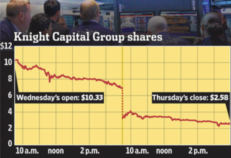
Better dashboard design wouldn’t have prevented the initial deployment error, but it could have turned a 45-minute catastrophe into a 5-minute glitch.
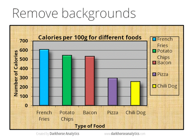
Clarity: Pack More Data Into Less Space
Most dashboards either show nothing meaningful in huge charts or cram everything unreadably. The solution is data density—maximizing insight per glance without clutter. Anything non-useful we call non-data pixels, and we want to reduce them. (Source: Edward R. Tufte)
Don’t visualize tiny datasets. Two data points? Write: “Product A sold 237 units; Product B sold 112.” Skip the chart.
Shrink ruthlessly. Thinner lines, smaller dots, tighter spacing. Fit more meaningful comparisons in the same view.
Use small multiples. Arrays of identical mini-charts make patterns instantly comparable across categories.
Example: Replace four giant, empty widgets with a compact grid showing revenue trends, regional performance, acquisition sparklines, and conversion funnels—all visible without scrolling.
✨ Want to apply these data visualization best practices in your product? Contact Pixelswithin for expert design and implementation.
Usability: Choose Your Weapons Wisely
Chart selection isn’t about showing off Tableau skills. Match the tool to the job.
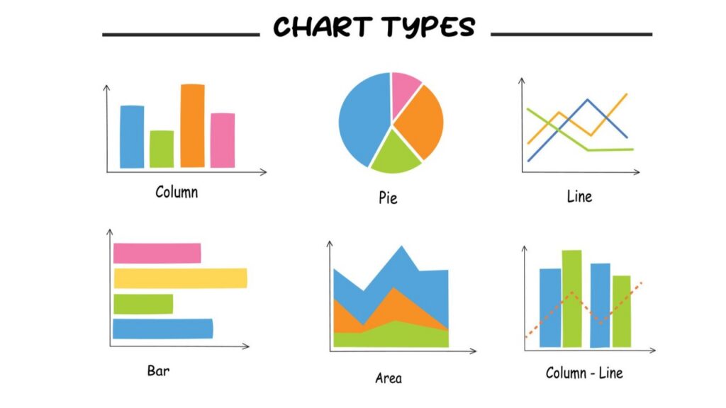
Bar charts: Excellent for comparing quantities across categories. Avoid overly long bars with few items—consider summary text instead.
Line charts: Best for trends over time. They reveal patterns and rates of change clearly.
Small multiples: These take different Y-axes into account. Use sets of consistent, thumbnail-sized charts for side-by-side comparison across multiple groups or variables. This technique scales well as data dimensions grow and answers the key question: “Compared to what?”
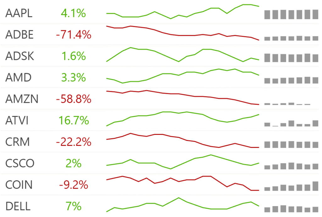
Sparklines: Tiny, word-sized sparkline charts embedded inline provide compact trend context without interrupting flow. Ideal for tables or text. Scatter plots, histograms, treemaps, and maps: Choose when appropriate for your data type and question. Too many chart types in one view dilute clarity.
Color: Your Secret Weapon
Most dashboards vomit color everywhere. Use it like a surgeon’s scalpel—precisely.
- One or two accent colors maximum
- Make it colorblind-friendly (8% of men affected)
- Label clearly—color enhances, never replaces understanding
- Ensure sufficient color contrast (e.g., dark text on light backgrounds)
- Avoid color as the sole data channel; complement with shapes, textures, and labels, even minding the different “shapes” different text labels make is important — avoid close-to-homogeneous labels In Stock vs No Stock when crucial.
- Provide meaningful alt text for images and charts
- Design for keyboard navigation and screen readers
- Keep layouts responsive for mobile and tablet users.
Source: Resolution.de
The Serotonin Effect — From Anxiety to Mastery
Great visualization moves people from overwhelming complexity to serene comprehension.
Building Lasting Confidence:
- Tell a coherent story through logical narrative
- Progressive disclosure—headlines first, details on demand
- Embed context everywhere—annotations, benchmarks, comparisons
- Validate with externals—industry averages, historical data
When to Break Every Rule
Rules serve clarity, not constraint. Sometimes breaking conventions creates better understanding.
Justified Rule Breaking:
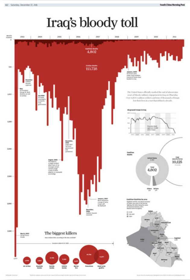
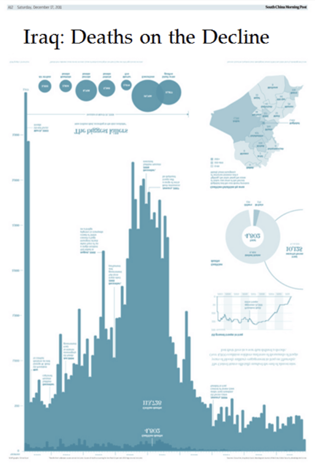
- Flip axes for impact: Simon Scarr’s Iraq casualties fell “from the sky”
- Skip legends: Direct labeling beats bouncing between legend and data
- Non-zero baselines: Stock movements need focused ranges to show patterns
- Replace tiny charts: Three data points? Write them out.
Expert Misconceptions:
- “More complexity = more insight”: Wrong. Simplicity often wins.
- “Interactivity fixes bad design”: It works best on solid foundations.
- “Always start Y-axis at zero”: Temperature and stock trends need focused ranges.
Source: Dataylon
Aside: What are focused ranges?
“Focused ranges” refers to setting your chart’s Y-axis to show only a specific, narrow range of values rather than starting from zero.
Examples:
Stock prices: If a stock trades between $98-$102 over a week, showing the full range from $0-$102 would make the price movements look flat. A focused range of $97-$103 reveals the actual volatility and trends.
Temperature anomalies: Climate data showing temperature departures from average might range from +0.5°C to +1.2°C. Starting the axis at zero would make these differences invisible, but focusing on the 0° to +1.5°C range shows meaningful patterns.
Website conversion rates: If your conversion rate varies between 2.1% and 2.8%, a chart from 0% to 3% shows almost no variation. Focusing on 2.0% to 3.0% makes the trends clear.
The Trade-off:
Benefit: Reveals subtle but important patterns that would be invisible on a zero-based axis.
Risk: Can exaggerate small changes and mislead viewers about the actual magnitude of differences.
When to Use Focused Ranges:
- The zero baseline isn’t meaningful (stock prices, temperatures)
- You’re tracking small changes in continuous data
- The context makes the range obvious to viewers
- You clearly label the axis breaks or non-zero start
The key is being transparent about what you’re doing so viewers understand they’re seeing a “zoomed in” view of the data.
Accessibility: The Non-Negotiable Foundation
Accessible design helps everyone:
- High contrast and readable fonts
- Don’t rely on color alone—add shapes, patterns, labels
- Write meaningful alt text for screen readers
- Support keyboard navigation
- Test with real assistive technology
The Million-Dollar Opportunity Everyone’s Missing
While everyone chases AI and crypto, billions sit trapped in incomprehensible dashboards. The companies making fortunes aren’t inventing new data—they’re making existing data understandable.
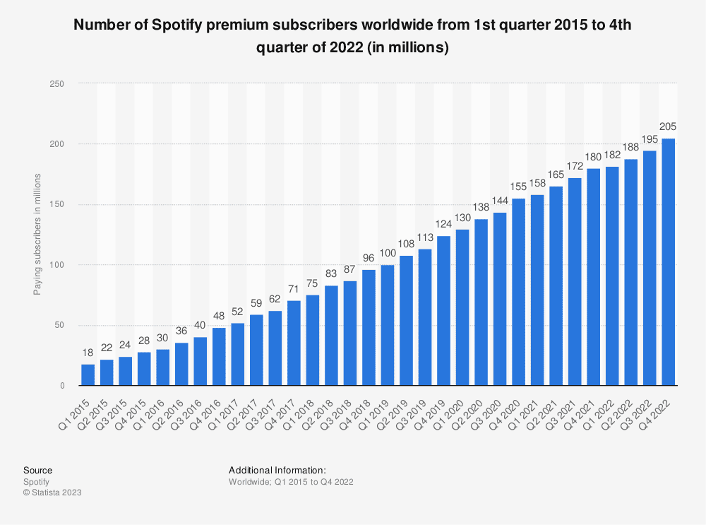
Slack made chat organized. Spotify made music discovery intuitive. Stripe made payments simple. The pattern: take something frustrating and make it delightfully clear.
Summary: Your Action Plan
| Priority | Focus | Implementation |
|---|---|---|
| Clarity | High-density data | Kill tiny charts; shrink elements; use multiples |
| Usability | Right tools, smart color | Match charts to questions; limit palette; label directly |
| Confidence | Clear storytelling | Progressive disclosure; context; narrative |
| Accessibility | Universal design | High contrast; multiple channels; keyboard support |
The companies getting rich aren’t building the fanciest animations—they’re turning user anxiety into confidence, one clear chart at a time.
That serotonin moment when my client went from frantically searching to confidently discussing metrics? That’s not just good UX—that’s the foundation of trust and business success.
✨ Want to apply these data visualization best practices in your product? Contact Pixelswithin for expert design and implementation.
Leave a Reply