
Clean People had spent a decade building loyal customers who loved the convenience, but their startup branding strategy was actively working against them.
Within our first conversation, I diagnosed this urgent problem for a tech-driven laundry delivery service.
Ten years into running his laundry wash & delivery service, Nigel wanted help upgrading Clean People’s technology infrastructure to handle rapid growth.
“Clean People” sounded like a corporate laundry service targeting businesses, not the delightful B2C experience Nigel had built.
The logo was nonexistent. The sterile colors completely contradicted Nigel’s authentic mission: he genuinely finds laundry fun and wanted to share that joy.
“The easiest way to do laundry is to let us do it for you,” ended up being their new tagline—but their brand at that point looked nothing like the delightful consumer experience they’d created.
This is the art direction problem that haunts most successful startups: the gap between what you’ve built and how it feels to experience it.
How to Come Up With Your Startup Branding Strategy
Startups have an art direction problem.
Most founders know when their design isn’t living up to its potential. They’ll search for solutions like 🔍
- “Startup branding”
- “Brand identity for startups”
- “Cohesive visual identity”
- “Consistent design”
- “Polished startup design”
- “Professional branding agency for early-stage companies”
- “Startup visual style”
- “Startup brand guidelines”
- “Cohesive branding”
- “Design systems for startups”
- “Startup aesthetics”
- “Visual consistency for startups”
- “Startup brand look and feel”
These are all ways of fumbling toward the same goal: a cohesive visual and emotional system that makes your startup look legit, trustworthy, and instantly recognizable. That’s art direction.

I’ve worked with founders and nonprofits who came to me with this exact challenge. The good news? You don’t need a startup branding agency to solve it. You can build your own art direction playbook if you approach it step by step — and keep it honest to your mission.
Because here’s the truth: people can smell fakeness. A slick aesthetic that doesn’t line up with your purpose will push people away. But an honest aesthetic multiplies your message.
I’ve worked with dozens of founders stuck in this exact spot—from Popwash (formerly Clean People) to Mermory, a social flashcard app for students, to Katacoda, an interactive learning platform that O’Reilly Media eventually acquired.
The pattern is always the same: great product, confused startup brand strategy.
Here’s what I’ve learned about closing that gap.
The Moment Everything Clicks For Your Startup Brand Identity
Before diving into process, let me tell you about the moment founders know they’ve nailed their art direction.
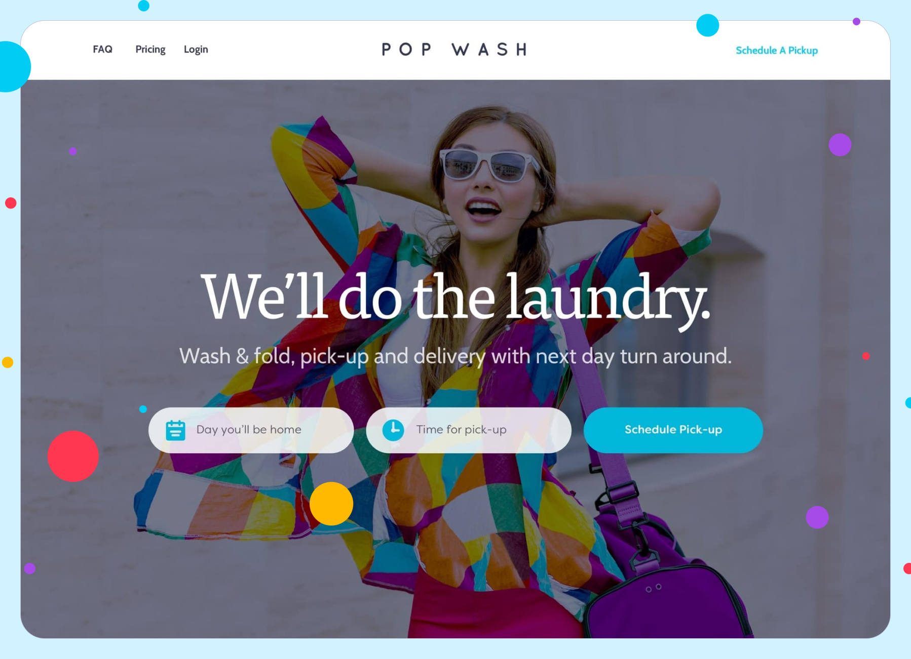
It happened with Popwash when we replaced their sterile hospital aesthetic with warm, approachable colors and friendly typography. Nigel pulled up the new homepage and just stared. “This is what I’ve been trying to build all along,” he said. “Now people can see it too.”
That’s the feeling you’re chasing: when your visual identity finally matches your mission so perfectly that explaining your startup becomes effortless. When customers look at your brand and immediately get what you’re about.
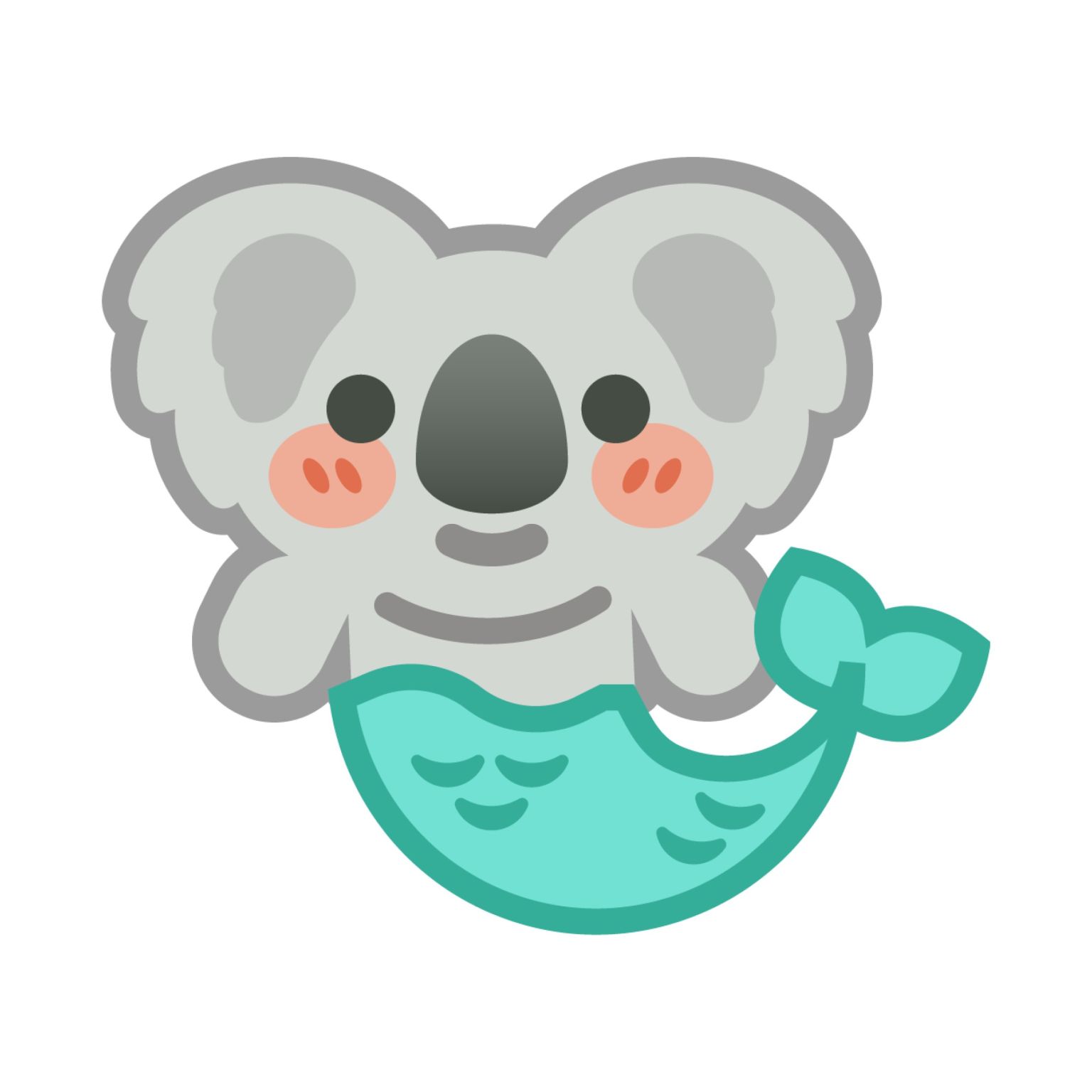

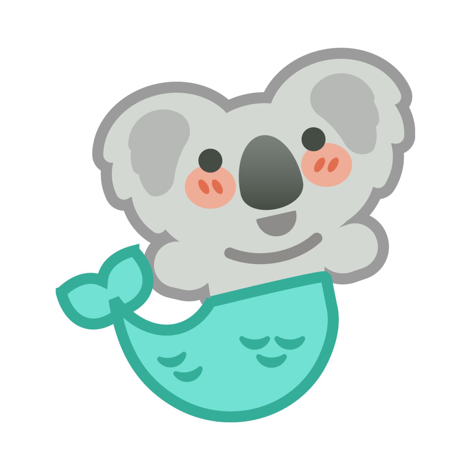
For Mermory, it was when I drew their mascot—a friendly character that embodied the social, collaborative spirit of studying together. Suddenly their app wasn’t just another flashcard tool. It was a study buddy.
How to Define Your Startup’s Visual Brand Identity Without Hiring an Agency
The first step in building cohesive startup visual identity isn’t choosing colors or fonts. It’s getting crystal clear on what your product actually feels like to use.
Start With Adjectives, Not Aesthetics
When Clean People came to me, they knew their decade-old startup branding strategy felt dishonest for their B2C consumer experience, but they couldn’t articulate why. We started with a simple exercise: describe your product in three adjectives.
Brand Adjectives for Startups (Pick 2 or 3)
| Accessible | Adventurous | Authoritative | Adaptable |
| Approachable | Aspirational | Calm | Casual |
| Charming | Creative | Classic | Comprehensive |
| Collaborative | Cutting Edge | Daring | Direct |
| Distinctive | Down To Earth | Energetic | Eloquent |
| Established | Fearless | Formal | Heart-felt |
| High-end | Honest | Inclusive | Informal |
| Imaginative | Inspirational | Innovative | Inviting |
| Knowledgeable | Logical | Luxurious | Loving |
| Meaningful | Mindful | Motivated | Modern |
| Original | Passionate | Professional | Practical |
| Reflective | Resourceful | Romantic | Sincere |
| Sociable | Strategic | Sustainable | Thoughtful |
| Traditional | Timeless | Trustworthy | Unique |
| Visionary | Warm | Witty | Zany |
Popwash’s first attempt: “professional, reliable, efficient.”
That’s when I knew we’d found the problem. Those adjectives described a corporate laundry service targeting businesses, not Nigel’s authentic B2C mission.
Here was someone who genuinely loves the satisfying feeling of fresh, perfectly folded clothes and wanted to give that gift to busy consumers. We workshopped new adjectives: “joyful, effortless, reliable.”
The honesty breakthrough changed everything. Joyful meant warm, saturated, inviting colors that reflected Nigel genuine enthusiasm. It meant circles and rounded corners as a visual language. Effortless meant approachable typography and friendly consumer-focused messaging. The startup branding strategy from Clean People to Popwash captured this perfectly—it sounded playful and energetic, just like Nigel’s approach to laundry.
Use Metaphors as Your North Star
Sometimes the fastest way to align visuals with mission is through a powerful metaphor.

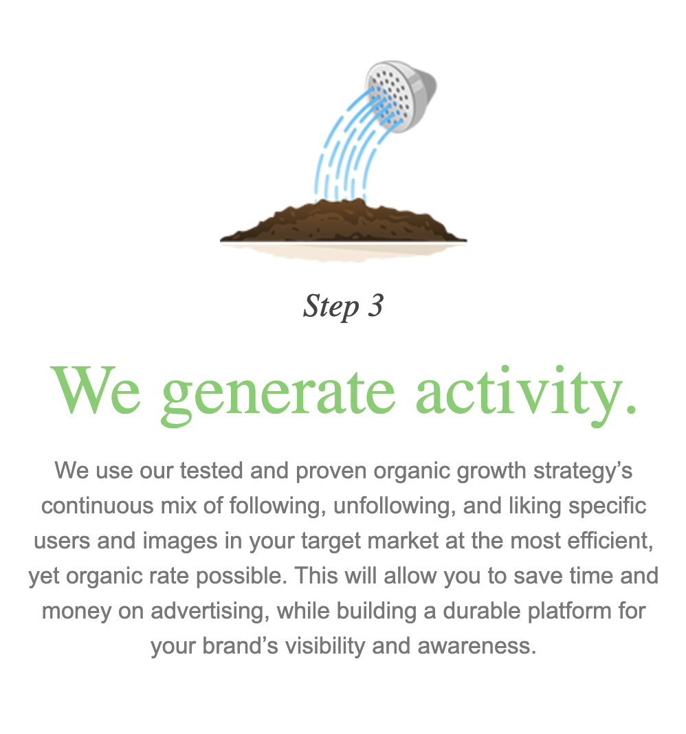
Sogro, a business growth platform, had photos of random penguins on their About page. Cute, but meaningless. I replaced them with a simple visual story: seed → sprout → mature plant. It perfectly captured their name and mission. Their landing page conversion rate jumped from 4% to 10% literally overnight.
Metaphors work because they give people an instant framework for understanding what you do — indispensable for your startup branding strategy.
Step-by-Step Startup Brand Guide
Once you’ve nailed your adjectives and metaphors, you can build a visual system that reinforces them consistently across all customer touchpoints.
Colors That Match Your Mission (And Actually Work)
Use color psychology strategically:
- Hot colors or bright colors (reds, oranges, corals, neons) energize → perfect for fitness, productivity, action-oriented startups
- Cool colors or pastel colors (blues, greens, bubblegum pink) calm and build trust → ideal for finance, healthcare, family-focused products
Take a look at the difference it can make.
But here’s a crucial part: use a tool like a11ycolors.com to narrow down your color scheme from the start. If you want purple for that royal, premium feel, don’t just pick any purple—use the accessibility checker to find purple combinations that meet WCAG contrast standards right out of the gate.
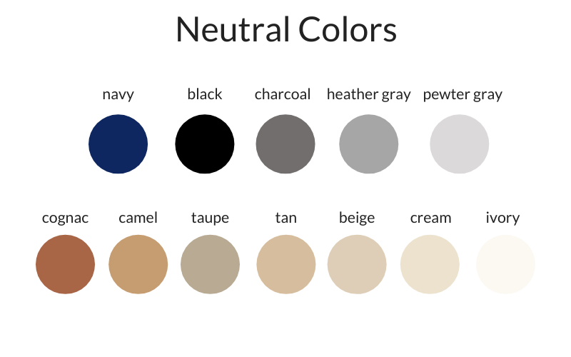
Don’t forget neutrals. A warm beige feels soft and human, a pure gray feels sterile, a slate blue feels modern. The neutral you choose changes the whole emotional temperature of your startup brand strategy.
Why Color Contrast Matters Beyond “Accessibility”
Yes, good contrast helps people with visual disabilities—and that should be reason enough. But contrast also serves everyone else:
- People using phones outside with screen glare can still read your content
- Tired users scrolling at night don’t have to strain their eyes
- Anyone scanning quickly can process information without their eyes glazing over

When people have to work to read your content, they simply don’t.
Typography That Prioritizes Instant Legibility
- Serif fonts = authority, tradition, editorial (think financial services)
- Sans-serif fonts = modern, clean, tech-forward
- Rounded sans-serif = friendly, approachable, human
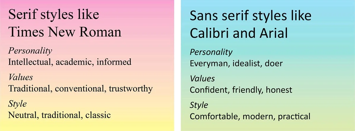
But here’s the non-negotiable rule: instant legibility trumps everything. Don’t sacrifice readability for aesthetics, even if you find the “perfect” font with a quirky G or unusual character spacing. If users have to pause for even a millisecond to decode a letter, you’ve lost them.
Your font should be invisible—users should absorb your message without noticing the typography at all. Even free Google Font combinations can carry a startup beautifully when chosen with clear intention and tested for immediate readability.
Build Imagery That Feels Alive
Now comes the fun part: generating imagery that feels like your brand.
Find Artistic References
Take your adjectives and ask AI: “Given these adjectives [playful, curious, bold] and industry [education], which visual artists’ work aligns with this vibe?” This gives you a lineage of style to draw from instead of random moodboards.
Take a look at how this strategy created an illustration style based on the vibe of Shel Silverstein for a startup brand strategy.
Subject vs. Style
When you find an artist reference you like, feed samples into AI and ask it to separate subject (what’s depicted) from style (how it’s depicted). For example:
- Subject = “abstract figures in motion”
- Style = “rough textured brushwork, vibrant colors”
This helps you articulate what you want beyond “I just like it.”
Brainstorm Before You Burn Credits
Here’s a pro tip: you don’t need to generate 50 images to find your direction. You can have back-and-forth conversations with AI about metaphors, moods, and imagery ideas. Brainstorming in text first saves your image credits and gets your prompts sharp before you hit “generate.”
Question: Is this stealing?
Answer: Sure.
Static imagery is what people scroll past. Engaging imagery has:
- Characters with expressive body language rather than stiff poses
- Implied motion—capture things mid-action, not frozen
- Emotional tension—show the peak moment, not the setup
When I designed Mermory’s mascot, I made sure it looked mid-conversation, like it was actively helping students study together. That single character communicated their entire value proposition: studying doesn’t have to be lonely.
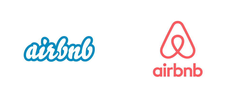
Real-World Example: Airbnb
When Airbnb refreshed its brand, it ditched generic stock photos for warm, hand-drawn illustrations. Suddenly the platform felt human, belonging-oriented, and global. That’s startup branding strategy at work: showing values in style, not just words.
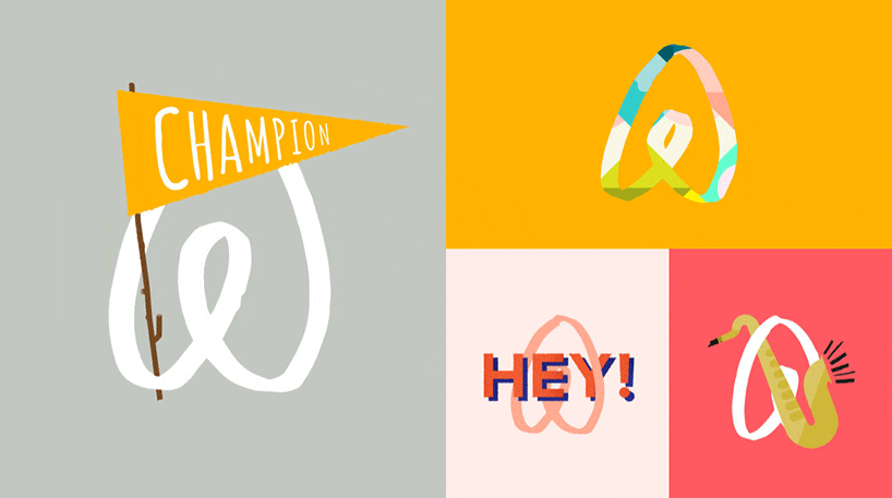
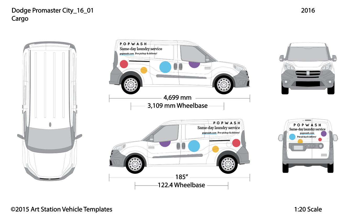
This art direction will inform your entire visual identity. For example, look at how Popwash’s new brand informed their company’s van.
How to Apply Your Visual System Across All Startup Touchpoints
Professional Layouts That Support Your Brand Identity
Use proven frameworks like Tailwind CSS and open-source UI kit libraries like HyperUI and Klutty to handle the technical structure. These give you professional, accessible layouts without the development overhead.
Then inject your custom colors, fonts, and imagery into that proven skeleton. The layout stays professional and conversion-optimized; the personality becomes unmistakably yours.
This startup branding strategy lets bootstrapped startups compete visually with companies that have full design teams—you get the professional foundation, but with your authentic brand personality layered on top.
Voice That Matches Your Visuals
Your adjectives should guide your language, not just your design. If your brand is approachable and effortless, your copy can’t sound corporate and stiff.
Quick test: read your homepage copy out loud. Does it sound like someone your target customer would actually want to work with? Does it feel natural for you to speak in that voice?
Phase 4: Test and Validate
Show your visual system to people in your target audience and ask two questions:
- “What does this make you feel?”
- “What kind of company do you think this is?”
If their answers align with your adjectives, you’re on track. If not, adjust.
With Katacoda’s interactive learning platform (which O’Reilly Media eventually acquired), we knew we’d nailed the art direction when beta users started describing it as “the most approachable way to learn complex technical skills”—exactly the feeling we’d been designing toward.

The Compound Effect of Honest Art Direction
Here’s what happens when you get art direction right: everything becomes easier.
Your website converts better because visitors immediately understand what you’re about. Customer conversations get smoother because your visual identity does half the explaining. Hiring even becomes easier because potential employees can see your company culture in your brand.
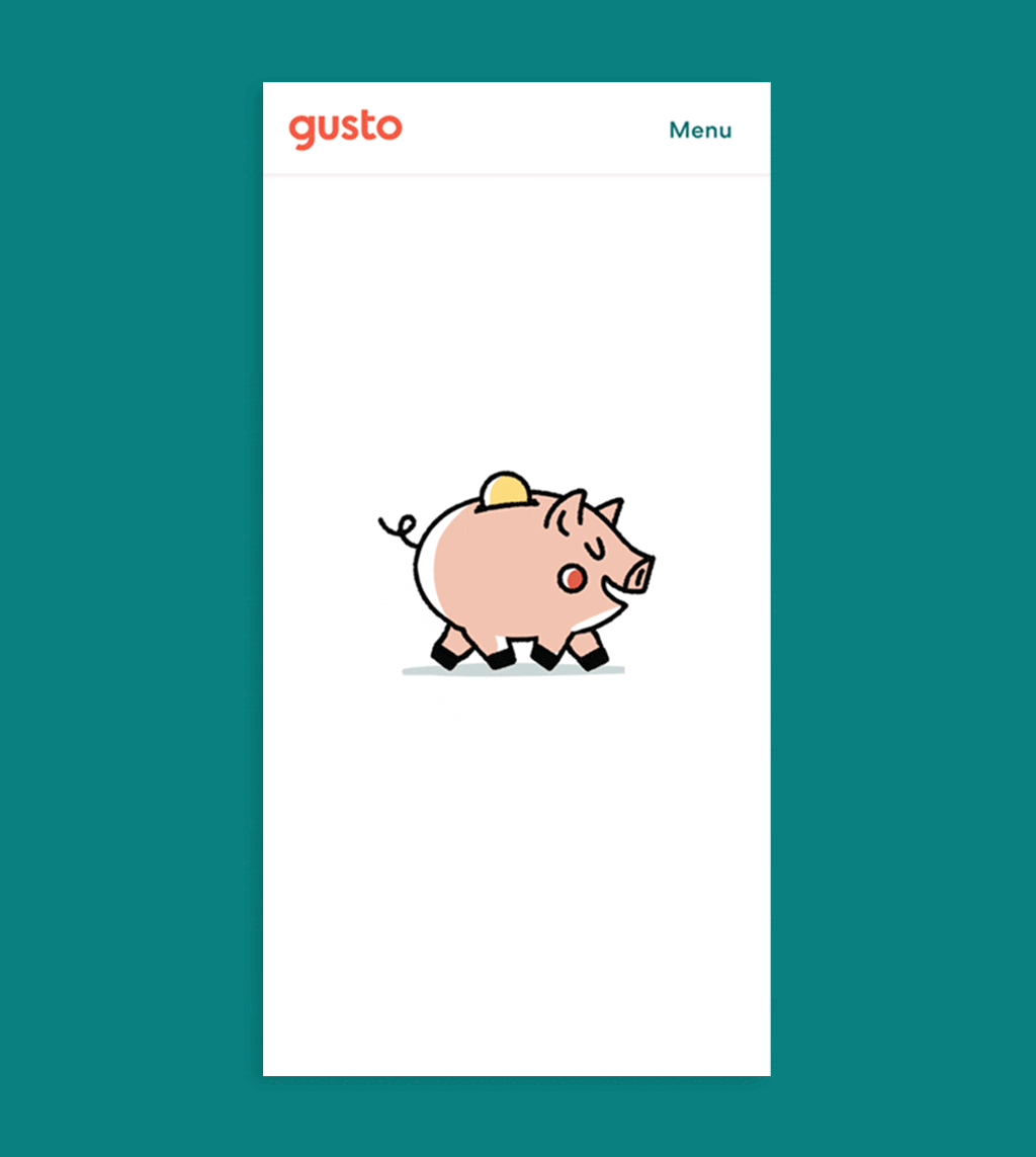
Engineers at Gusto express love for this animation.
Most importantly, you stop feeling embarrassed about your startup’s appearance. Instead, you feel proud to share it.
Art direction isn’t decoration—it’s a force multiplier for everything you’ve already built. When your visual identity honestly reflects your mission, it stops being a barrier and becomes a bridge to the people you’re trying to reach.
Ready to Bridge the Gap?
If you’re stuck in that familiar place—knowing your startup deserves better visual representation but not sure how to get there—that’s exactly where I come in. At Pixelswithin, I help founders translate their vision into art direction that works as hard as they do.
The difference between confusing branding and compelling art direction often comes down to one thing: someone who can see what you’ve built and help the world see it too.
Ready to close the gap between your product and its visual identity? Let’s talk about your art direction journey →
Leave a Reply