Consumer App · Mobile · Spiritual Technology · 2025
Building for how a community actually thinks — not how productivity apps assume they do.
The project
A grimoire is a witch’s journal — a private record of rituals, spells, observations, and insight. Physical grimoires have been central to practice for centuries. The problem is that they stay physical: left at home, filled unevenly, and incapable of surfacing patterns across months of entries without manual review.
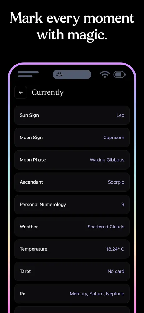
Pixelswithin designed and built a mobile grimoire app for iOS — spiritual journaling software that pulls metadata from five external APIs silently, tags each entry automatically with the moon phase, astrological sign, weather, current Spotify track, and numerological context, and presents those tags as poetic, sigil-like stamps rather than database fields.
The goal wasn’t to digitize journaling. It was to make the invisible visible — to let patterns emerge that a paper journal never could.
The challenge
Building a system that felt magical while being technically complex.
Physical grimoires aren’t always accessible. They stay at home when you need them elsewhere, insights written in haste don’t resurface organically, and there’s no way to ask a paper journal what moon phase you were in last time you felt a particular way.
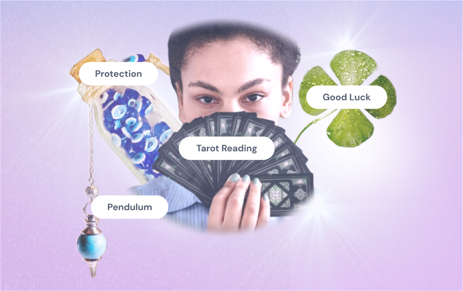
Five external data sources — Spotify, astrology, numerology, weather, and tarot — each with different authentication models, rate limits, response formats, and caching requirements. Pulling them together invisibly, reliably, and fast enough that it felt effortless was a real engineering problem.
An early light-purple design was rejected outright by the target community. The aesthetic signaled the wrong tradition. Building for a specific community meant understanding not just what they needed functionally, but what they would trust visually — and what would immediately feel like it wasn’t made for them.
“The interface needed to honor the mystery and symbolism of traditional sigil practices while translating abstract metadata into clear, meaningful interactions.”Pixelswithin · Design brief
How we solved it
Three decisions that made the app worth using — and worth trusting.
Invisible architecture
Every journaling app asked users to manually categorize entries, add tags, and fill in metadata fields. The ritual was interrupted by a form.
Five APIs pull silently in the background — moon phase, astrology sign, weather, current Spotify track, numerology. The entry saves. The stamps appear. No user input required.
Sigil-like stamps
Metadata meant database labels: strings of text, dropdowns, timestamps. Clinical. Cold. Nothing a witch would willingly interact with.
Tags reimagined as poetic, sigil-like stamps: "Waxing Crescent in Pisces," the song playing when the entry was written, the current weather at the moment of journaling. Chakra-coded by frequency — purple to red — to draw the eye to what recurs.
Community alignment
Initial light-purple design was immediately dismissed by the target community as "love and light" — the polished, sanitized face of mainstream wellness, not the deeper tradition they practiced.
Dark-mode-first redesign with arcane typography, subtle line iconography, and slower interactions with soft fades. Privacy-first architecture (spells are intellectual property). An app that felt like it belonged to the community, not marketed at it.
The app
Surface simplicity. Expandable depth.
Every screen was built around a single question: does this feel like it belongs in this tradition? The dark mode wasn’t a preference setting — it was the only mode. The tags didn’t look like tags. And everything the app knew, it learned on its own.

Automatic sigils mark the moment
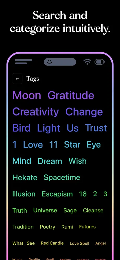
Tagging by frequency
How it came together
Validated before it was built. Designed for a community that knows the difference.
Before any design work, we ran market validation: a "Tech Witchcraft" course selling HTML/CSS skills to witches. $0.11 cost-per-click and 18% conversion confirmed that this community was underserved, digitally curious, and willing to pay. Thirty sales before a line of app code was written.
Five external APIs — Spotify, astrology, numerology, weather, and tarot — each with different rate limits, data formats, caching requirements, and authentication models. We mapped every integration, defined the caching strategy, and designed the data schema before touching UI. MySQL backend with a lightweight Node.js layer, built for future scalability.
The pivot from light to dark wasn't just a color change. It was a signal. We went back to the community, ran informal testing, and rebuilt the design language from the ground up: heavier type, slower motion, deeper contrast, iconography that referenced craft rather than productivity. The goal was an app that looked like something a witch would leave on their altar.
The final architecture honored one principle: the user should feel nothing technical. Entries save. Stamps appear. Patterns surface over time. Community testers were recruited before launch — their feedback shaped the chakra-coded tag hierarchy, the decision to make spell entries private by default, and the depth of expandable metadata for users who wanted to go further.
Outcome
“Turns out the best apps are ritualistic.”Pixelswithin internalPost-launch reflection
Start a conversation
Building something for a specific community?
Community-specific products live or die by how well the design understands the culture. If you’re building for an audience with strong identity and opinions — let’s talk.