EdTech · Product Design & Development · 2025
How a focused MVP strategy and a merkoala mascot gave students a reason to choose Mermory over Quizlet.
The project
Mermory is a student social network built around flashcard studying — a space where spaced repetition meets a For-You-Page, where daily streaks replace passive re-reading, and where the product knows your friends’ study habits as well as it knows yours. The founders came in with a strong concept and a clear competitive target: Quizlet and Knowt.
The challenge wasn’t ambition. It was scope. A limited budget meant the team couldn’t ship everything — and without a framework for deciding what to cut, they risked shipping a diluted version of everything instead of an excellent version of anything. The brand faced the same problem: Knowt had already staked out its visual territory, and a generic study-tool aesthetic wouldn’t move students.
Pixelswithin came on to handle brand, UX, and development end-to-end: name the product, define the MVP, design the experience, and ship it. The goal was a product students would remember — and come back to after the exam.
The challenge
Competing with Quizlet on a limited budget — without looking like Knowt.
Six study methods were on the roadmap. The budget supported two — maybe three, done poorly. Without a principled way to cut, every feature would get shipped at half quality. The MVP needed a framework, not a guess.
Quizlet has brand recognition. Knowt had already claimed a strong visual identity. A generic pastel study-tool look wouldn’t move students who already had two good options. The brand needed to be distinct without being strange.
Students study hard around exams and disappear after. Without a social or gamification layer, any study tool becomes optional the moment the pressure lifts. The product needed a reason to open it on a Tuesday when nothing was due.
“The brand had to be right from the start — students make snap judgments. If it looked like every other study app, they’d assume it worked like every other study app.”Pixelswithin, on the brand brief
How we solved it
A name, a mascot, two study modes, and a social layer students actually use.
Brand Identity
No name, no visual system, no personality. The founders had a concept and a competitive target — but nothing students would remember or choose over an established tool.
Name found via bubble-sort ideation: "Mermory" — memory meets mermaid. A merkoala mascot (koala-mermaid hybrid) became the face of the product. A nautical XP system — starfish to whale — gave students something to work toward.
Product Scope
Six study methods on the roadmap. Unlimited scope with a limited budget — a combination that produces mediocre execution across every feature instead of excellence in any of them.
A VALUE × FEASIBILITY matrix cut the list to two: spaced repetition and learn mode. Shipping fewer methods meant shipping them well — and the data proved the instinct right.
Social UX
Study tools are useful but rarely social. Engagement drops once the exam passes. Without a retention layer, users leave when the urgency does.
Daily goals pie chart, streak tracking, a For-You-Page discovery feed, and a Study Now CTA that shows the next question before the student commits — a social gamification layer built for the way students actually procrastinate.
The product
Designed to feel familiar — and impossible to forget.
Restraint-based visual identity — white space, a controlled palette that avoided Knowt’s color territory, and the merkoala as the anchor. Every screen was designed around the two study modes and the social layer, with nothing extra in the way.
Dashboard — daily goals pie chart, active streak, and a Study Now CTA showing the next question before the student commits.
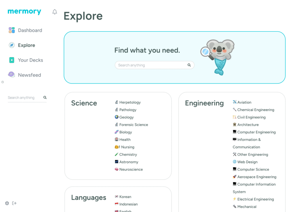
Explore feed — FYP-style discovery of public decks, friends’ activity, and trending study sets.
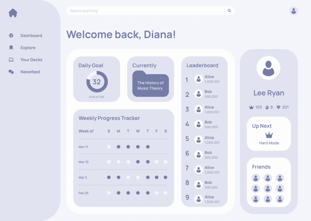
XP and level system — nautical tiers from starfish to whale give students something to work toward beyond the next exam.
How the work happened
Rough to refined — decisions made before pixels were placed.
Rough wireframes came first — fast, low-fidelity, enough to make tradeoffs visible. Then the VALUE × FEASIBILITY matrix. Every proposed feature was plotted by user impact against implementation effort. The matrix made the conversation easy: two study methods went into the MVP, four went into the backlog. Budget and scope aligned before any polish work began.
Naming came from a structured ideation session — words associated with memory, water, and study — sorted and recombined until one stuck. "Mermory" tested well because it was pronounceable, memorable, and didn't live in Quizlet's or Knowt's color territory. The merkoala mascot followed: a character that felt warm without being juvenile. Nautical XP tiers gave the system a theme that scaled.
Refined wireframes built around the two chosen study modes, then extended to the social layer. The daily goals chart, streak system, and FYP feed were designed as a cohesive retention layer — not bolted-on features. The Study Now CTA showing the next question was a deliberate interaction design choice to reduce the friction between intent and action.
Development followed the finalized designs without scope drift — the upfront matrix work meant there were no late-stage debates about what to include. Usability testing sessions closed the loop: students used the product without prompting, asked who had designed it, and kept going. Founders stayed motivated throughout — a meaningful signal in a long product sprint.
Outcome
“We went into usability testing not sure whether students would get it. They got it immediately. They didn’t ask how anything worked — they just started using it. One person stopped and asked who had designed it. That was the moment we knew the brand had landed. The fact that we only shipped two study methods turned out to be the right call — the product felt focused instead of scattered, and users trusted it more for it.”EdTech startup founderMermory · Los Angeles
Start a conversation
Building something students will remember?
If you’re working on an EdTech product and need brand, UX, and development under one roof — let’s talk. A real conversation about what you’re building before any commitment.