SaaS Marketing · Web Design & Development · Santa Monica, CA · 2025
How a simpler Sogro website turned a stagnant signup funnel into $1M ARR.
The business
Sogro helps entrepreneurs and small businesses grow their social following through intelligent hashtag connections. Founded by Aaron Irmas in Santa Monica, the product had real traction — over 5,000 paying users — and a clear value proposition. The problem wasn’t the product. It was everything around it.
The website had barely changed since launch. It read like a feature checklist, looked dated against newer SaaS competitors, and gave visitors no clear sense of what they were actually signing up for. Conversion sat at 4% — and Aaron knew it should be higher. He just hadn’t been able to pinpoint what was getting in the way.
The redesign brief was broader than most: new brand direction, full site redesign, interactive pricing, mobile-first build, and a technical migration off Parse — a backend platform that had been discontinued. Aaron also needed self-serve visibility into account and payment data without relying on a developer for every lookup.
Before the redesign
A product with real traction, held back by a website that didn’t show it.
Visitors couldn’t tell what they were signing up for. The site described features without explaining outcomes. With no clear value proposition and no pricing confidence, 96% of visitors left without converting. The copy buried the lead: “Join the 5,495 entrepreneurs who are already using Sogro” was nowhere near the top of the page.
Most of Sogro’s traffic came from mobile — driven by the tool itself, which users accessed on their phones. But the site hadn’t been built mobile-first. Navigation was clunky, pricing was hard to parse on a small screen, and CTAs required scrolling past content that wasn’t earning its place.
The site ran on Parse, a platform discontinued by Facebook. Every account lookup, payment question, or data request required Aaron to go through a developer. There was no dashboard, no self-serve visibility, and no path to fixing it without a full platform migration.
Aaron raised prices by 33% before launch — based purely on confidence in the new direction.
How we solved it
Three problems addressed. One cohesive redesign.
Brand & Positioning
Three different visual directions tested during discovery — the site had never committed to a clear personality. Visitors couldn't tell if Sogro was enterprise software, a growth hack tool, or something in between.
A confident, approachable brand with a single clear value proposition. 'You post. We grow.' Aaron raised prices 33% before the site even launched — based purely on confidence in the new direction.
Conversion Architecture
A feature list nobody read, a pricing page that required mental math, and a generic CTA that asked visitors to commit before they understood the product.
A storytelling homepage built around a plant-growth metaphor — shovel, seed, water, growing plant — replacing bullet points with a narrative. An interactive pricing calculator let visitors configure accounts and billing frequency before hitting a CTA. Strategic, second-person copy throughout.
Platform Migration
The site ran on Parse, a platform that had been discontinued. Aaron had no visibility into account or payment data without developer intervention — every lookup required a support ticket.
Full data migration from Parse to WordPress, preserving all historical records. WordPress Business Intelligence dashboards gave Aaron self-serve visibility into account health and payment status — no dev required.
The work
Brand, design, and platform — shipped together.
The redesign touched every layer of the Sogro web presence: visual identity, messaging architecture, interaction design, and backend infrastructure. Each piece was built to support the others — a stronger brand made the pricing page more credible; a cleaner migration made the dashboards possible.
Brand showcase — the redesigned Sogro identity in context.
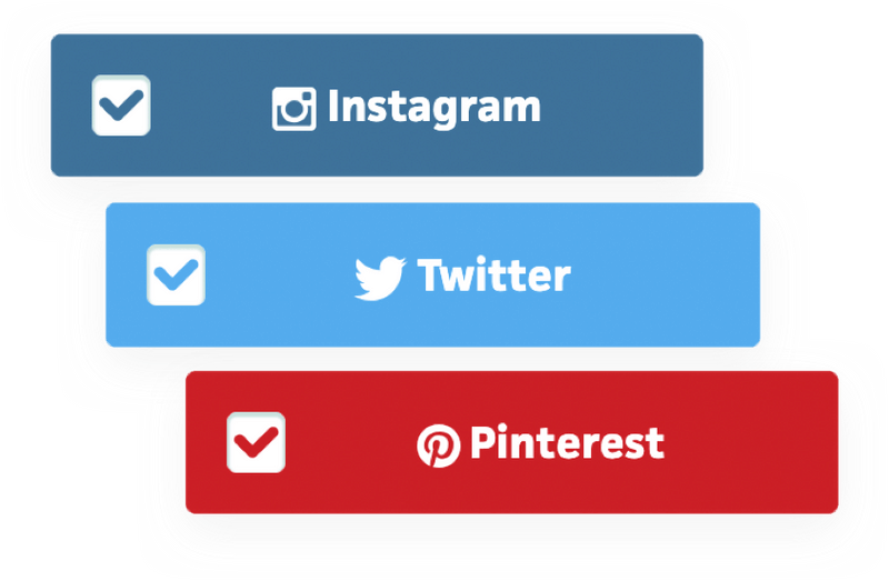
Social buttons and brand elements — part of the new design system.
How it happened
Discovery to launch — without losing a single historical record.
We tested three distinct brand personalities with Aaron and a small group of Sogro users: bold and data-driven, playful and social, and confident but approachable. Competitor analysis showed most SaaS tools in the hashtag space looked the same — sterile dashboards, jargon-heavy copy. The third direction won decisively. Approachable without being cute. Confident without being cold.
Because the Sogro tool itself was driving most site traffic from mobile, every screen was designed and tested on phones first. The homepage was rebuilt around a storytelling arc — the plant growth metaphor — that walked visitors from problem to solution without a feature list in sight. The pricing page became an interactive generator: pick your account count, pick billing frequency, see your number. Fewer decisions, more confidence.
Parse had reached end-of-life. The migration required careful data mapping to ensure every historical account, transaction, and user record moved cleanly to WordPress. Simultaneously, we built WP Business Intelligence dashboards so Aaron could answer his own questions about revenue and account status — without opening a ticket or waiting on a developer.
Aaron raised prices from $19 to $29 per month before launch — a 33% increase — because the new brand gave him the confidence to. The night the site went live, signups more than doubled. Revenue surged 3.8× almost immediately. Sogro crossed $1M ARR in the months that followed.
Results
“Clarity and confidence drive growth. Fewer, better-designed choices can unlock outsized results.”Aaron IrmasFounder, Sogro · Santa Monica, CA
Start a conversation
Working on something similar?
If your product has traction but your website isn’t showing it, let’s talk. A real conversation about what you’re trying to fix — before any commitment.