01Client-reported result
Traffic increased
The client reported a jump in traffic after the redesign.
Client case study
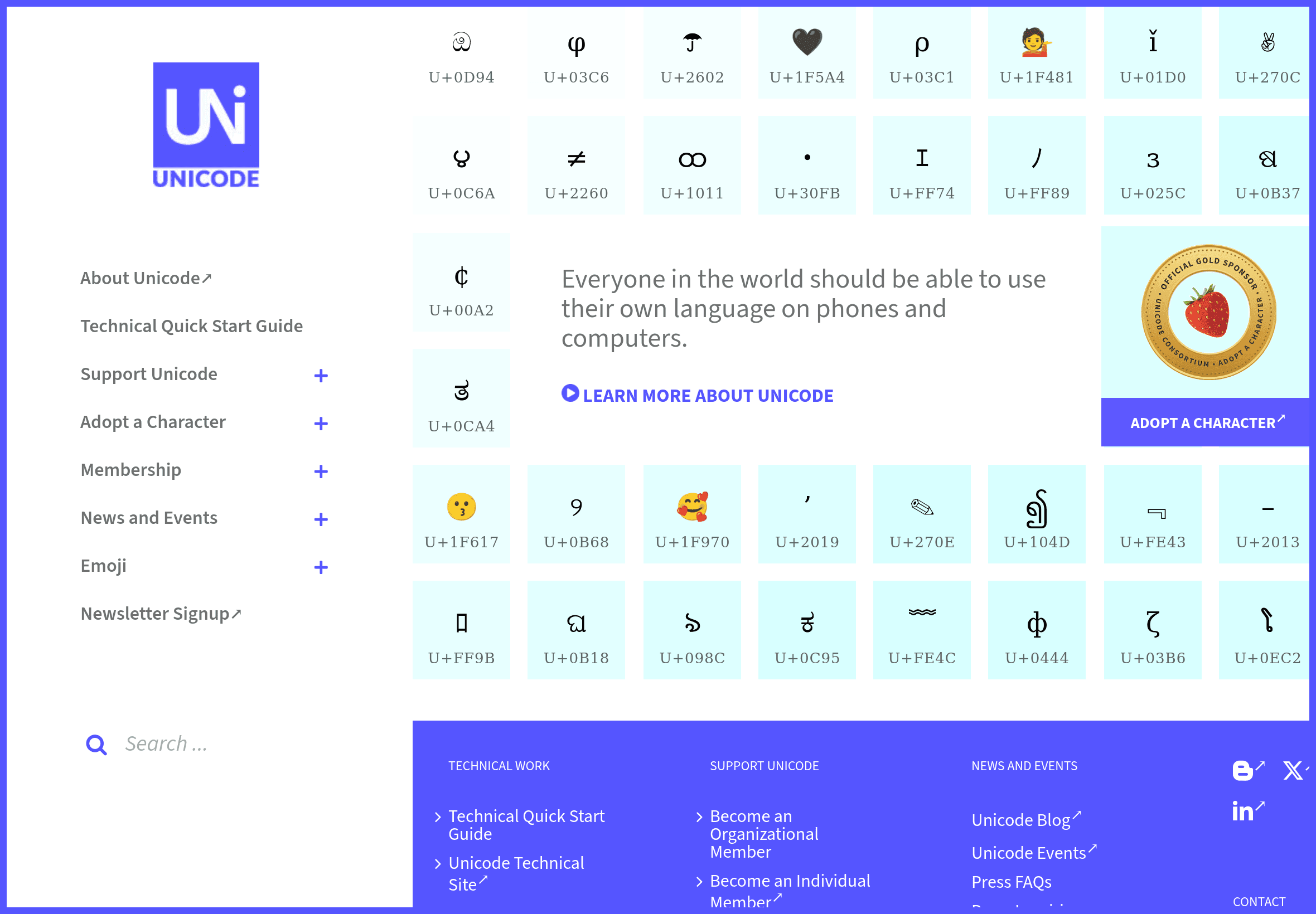
A 1990s-era website holding an enormous body of technical information became clearer and more usable for the global audiences who depend on Unicode.
Unicode reported a jump in traffic and several new sponsorships after the redesign.
Situation and responsibility
Unicode's standards make digital communication possible, but its aging website had to serve specialists, implementers, sponsors, and members of the public through a vast technical information structure.
The existing 1990s-era experience was especially difficult on phones. The redesign needed to improve general-public engagement without flattening the material experts depended on.
Important decisions
Each response follows from an observed condition. The last column marks the tempting shortcut the work needed to avoid.
| What you notice | What it may mean | A useful response | What to resist |
|---|---|---|---|
| Many audiences entered with different questions. | One undifferentiated hierarchy could not serve them all. | Create clearer paths by intent while preserving deep technical access. | Do not simplify by removing expert material. |
| Phone users faced a desktop-era site. | Responsive behavior had to reshape the hierarchy. | Design the primary journeys around smaller screens as well as desktop. | Do not treat mobile as a compressed afterthought. |
Decisions and delivery
Separate public orientation, organizational information, and specialist reference needs.
Create navigation and page structures that reveal depth in useful stages.
Carry the system through responsive visual design and frontend implementation.
Working through a similar constraint?
Describe the problem →Visual evidence
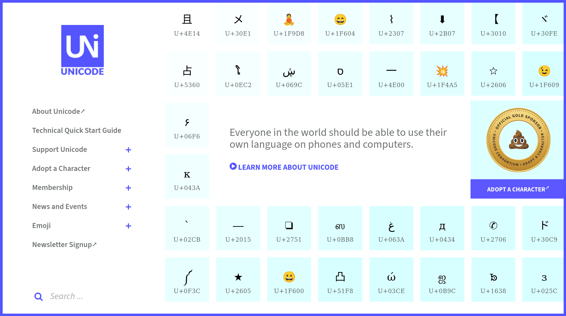
A sequence of available project views shows how the system behaves across moments, not only as a single polished frame.
Supported outcomes
Quantitative claims appear only where the repository provides them. The remaining outcomes are explicitly qualitative, operational, or statements of responsibility.
The client reported a jump in traffic after the redesign.
The client also reported several new sponsorships.
Technical depth remained available inside a clearer public experience.
If your website has to welcome the public without frustrating experts, show me where those paths collide.
Describe a similar problem →